
 chibiham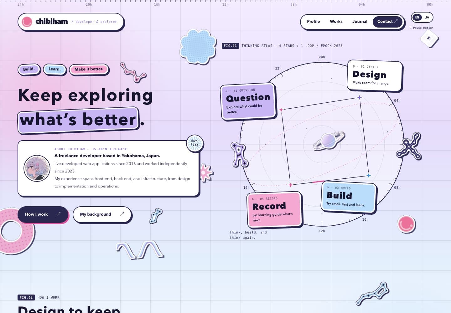
About this homepage built with Next.js.
Overview
Developed and maintained as a personal website to showcase profile, portfolio, and blog, raising my presence as an engineer.
Architecture
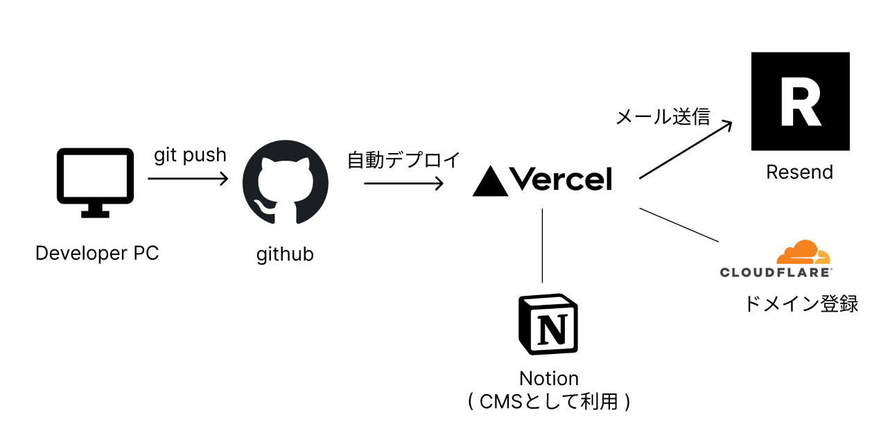
- Domain registration with Cloudflare
- Chose Vercel since I wanted to run a Next.js app and had no plans to separate frontend and backend
- Automatic branch-based deployments simply by connecting to GitHub
- Rich operational features including global CDN, auto-scaling, monitoring, DDoS protection, and environment variable management. Supports both SSG and SSR with Next.js
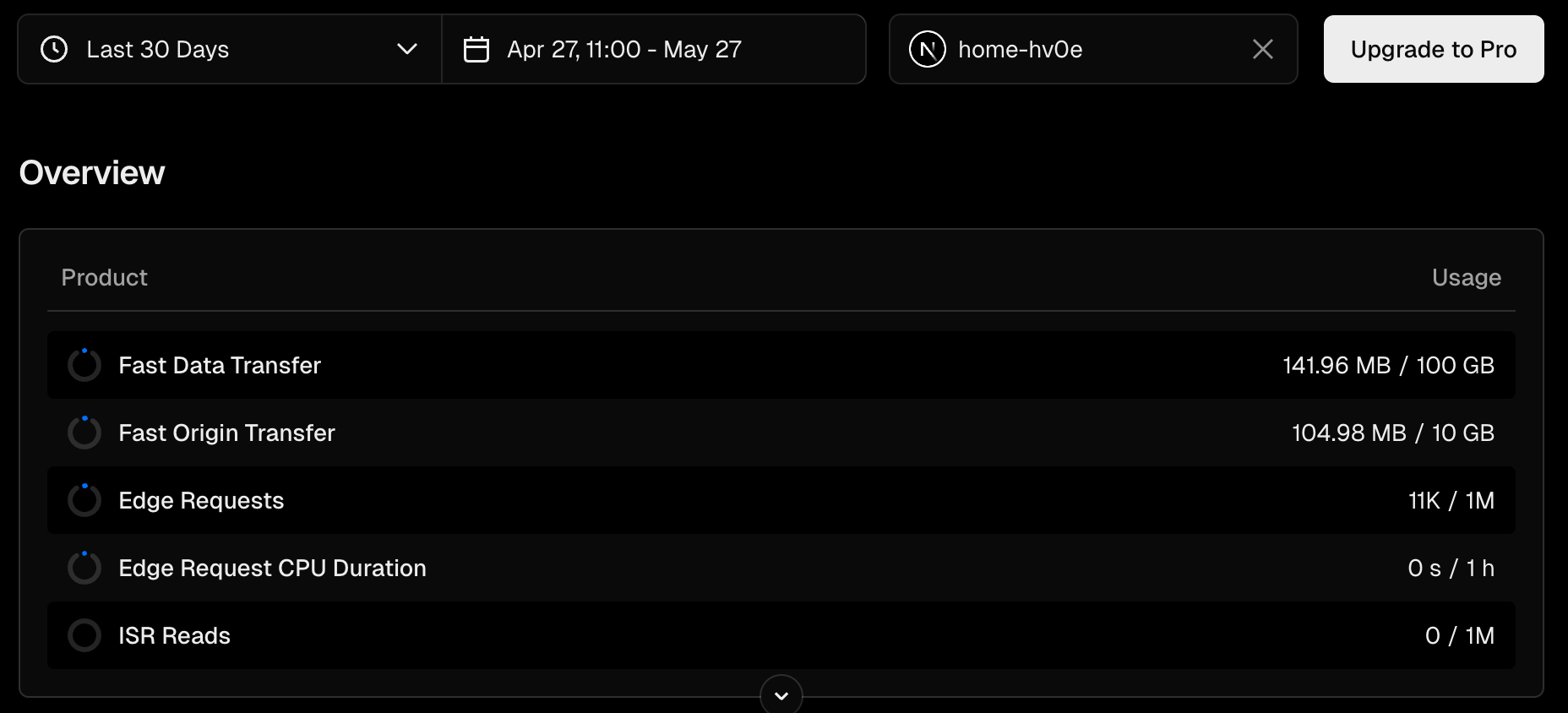
- Despite all these features, the free tier is generous — practically free to operate unless traffic is extremely high
- Plenty of headroom
- Markdown-based content management
- Markdown files placed under
content/blog/andcontent/portfolio/, managed with Git - Frontmatter parsed with gray-matter, rendered with next-mdx-remote
- Previously used Notion as a CMS, but migrated to simple Markdown management (details below)
- Markdown files placed under
- Resend
- Email delivery PaaS. Used for contact form email sending. Simple to use with a generous free tier
Tech Stack
- Next.js
- Provides both static and interactive pages with SSG/SSR support, offering great user experience and cost performance
- Enables component-based development with React while integrating frontend and backend
- No complex backend processing needed, so the architecture is kept simple using SSR and Server Actions
- Tailwind CSS
- Chosen for its SSG compatibility and as a utility-first approach that minimizes downsides in React component development
Design
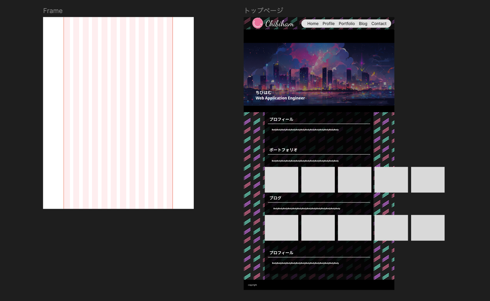
Used Figma for initial design exploration. Since this is a personal project, fine-tuning was faster done directly in code, so not much time was spent on details.
- Grid-based full-page layout adjustment (~2h)
- Background, logo, and icon image creation (~2h)
- Eye-catch images created with nijijourney (Midjourney)
- The chibiham icon was created through i2i with nijijourney from a hand-drawn illustration, then fine-tuned in Photoshop
A complete visual redesign (September 2026)
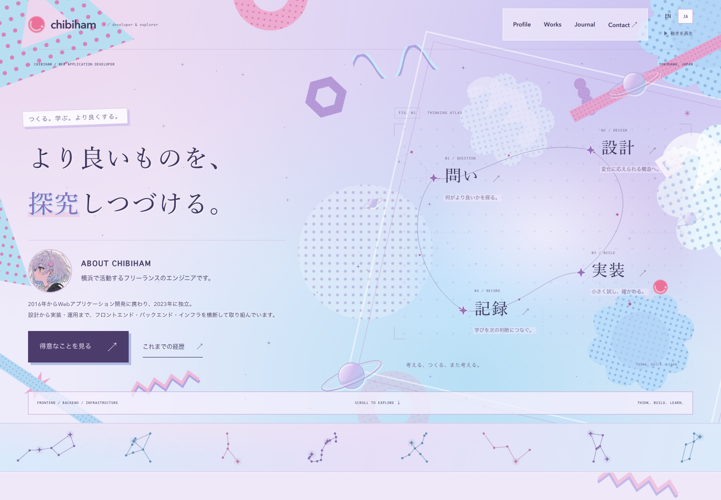
I revisited the homepage and the rest of the site around three themes: technology, kawaii, and personal conviction. Pale lavender and blue form the main palette, with pink accents. Halftone patterns, geometric shapes, and Saturn motifs create a soft, space-like atmosphere with a considered, structured feel.
I worked with Codex through a series of conversations, comparing animated mockups in the browser before bringing the design into the application.
1. Creating mockups
I started with several HTML/CSS mockups that explored different palettes, layouts, and pattern treatments. Making them interactive let me review movement, scrolling, and mobile layouts alongside the visual composition.
2. Aligning the visual direction
Through comparison, I combined the composition of concept C with the gradients of concept A, then increased the density of halftone and geometric patterns using a music video as a visual reference. The character’s hair colors guided the palette, alongside the existing sliced-ham SVG logo and Saturn motifs.
I also revised the copy using my profile and blog as context. The visuals convey softness, while the words focus on continually exploring what better means and maintaining the agility to respond to change.
3. Refining the details
I moved the avatar from the center of the hero into the introduction, leaving open space within an atlas connecting Question, Design, Build, and Record. I refined the ABOUT CHIBIHAM heading, avatar size and image, and spacing between headings and body copy in the browser, ultimately settling on concept F.
Below the hero, I added a slowly drifting, gently swaying band based on real star positions, including the Big Dipper, Aquila, Cancer, Scorpius, and Cygnus. The motifs retain the same pastel palette.
4. Applying the design
I translated the approved mockup into Next.js components and CSS Modules. Shared headers, footers, colors, and patterns carry the design through the profile, portfolio, blog, and contact pages. The homepage connects to the existing project and article content.
I checked Japanese and English, desktop and mobile, and light and dark appearances. A motion control and support for the device’s reduced-motion preference make the animation optional. After settling the direction in the mockups, I continued checking spacing and text fit with real content and working links in place.
A second pass: Sticker Cosmos (September 2026)
Looking at the redesign again after some time, I still liked the palette, but the page felt flat. The reason was that lavender, pale blue, and pink all sat at almost the same lightness, so there was little contrast between them. I kept the palette and raised the contrast, aiming for a page that feels busy but still holds together. This time I worked through it in conversation with Claude Code.
1. Comparing three directions
I first built mockups of three different directions using the same palette:
- G / Sticker Atlas: a zine-like page with sticky notes, tape, and stamps layered on graph paper. Line weights, shadows, and tilts are limited to a few values
- H / Night Chart: a star-catalog look with grid lines, scales, and coordinates on a deep navy background
- I / Pop Bento: a magazine-like grid of color tiles filled with photos and oversized type
All three share one rule: add more elements, but use fewer rules. The only additions to the palette were deeper shades of the same hues and a darker ink color, which create contrast.
2. Building on the existing star atlas
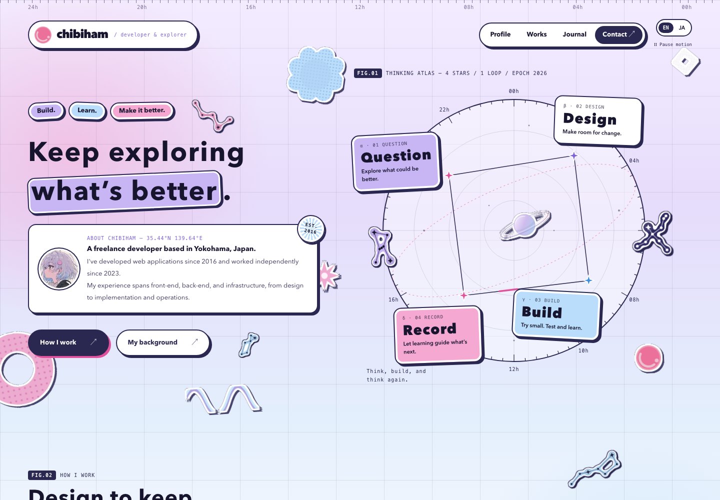
I liked the tactile feel of the stickers in G, but what I wanted was an extension of the current design (F). I put the goal into words, expressing both the rigor of science and the flexibility of ideas at once, and built J / Sticker Cosmos on top of F's star atlas.
- Rigor: a 5° scale and hour labels around the atlas, a dashed ecliptic, a grid, figure numbers such as
FIG.01, coordinates, specimen labels for projects (No. / DATE / STACK), and observation numbers for posts (OBS.018). All set in monospace type with thin lines - Flexibility: sticky notes, cards, buttons, and the header get rounded corners and a white rim inside an ink outline, like die-cut stickers
- Contrast: ink outlines, flat offset shadows, and navy panels add contrast. Headings stay at the same sizes as before
3. Finding the shape of the constellation stickers
Turning the real constellation SVGs into stickers took a few rounds. I first tried glossy, puffy stickers, and settled on flat stickers cut out along each constellation's lines and stars.
An SVG filter generates the shape. It blurs the lines and stars, thresholds them into a thicker body, and layers the body color, a white rim, an ink outline, and an offset shadow. No constellation needs its own cutout shape, and the sticker follows along when I swap in a different constellation.
4. Removing overlaps
Once the stickers were scattered around, some of them covered headings, buttons, or labels at certain screen widths. Instead of fixed positions, I placed the stickers inside the rows of buttons and taglines so they wrap together. Stickers next to headings sit in corners where no text appears. At 1200px and below, the atlas moves below the introduction in a single column and the pattern shapes are hidden. I checked each width at 390, 700, 1024, and 1440px to confirm nothing overlaps.
5. Applying the design
Colors, lines, shadows, corner radii, and white rims are gathered into CSS custom properties (tokens) and applied at once to the shared header, footer, and background, as well as to the panels, cards, article body, and forms on other pages. Because I kept the existing class names and replaced only their styles, the page components barely changed. I rebuilt the homepage components in J's layout and made the constellation sticker a shared component that takes only a constellation name and a color.
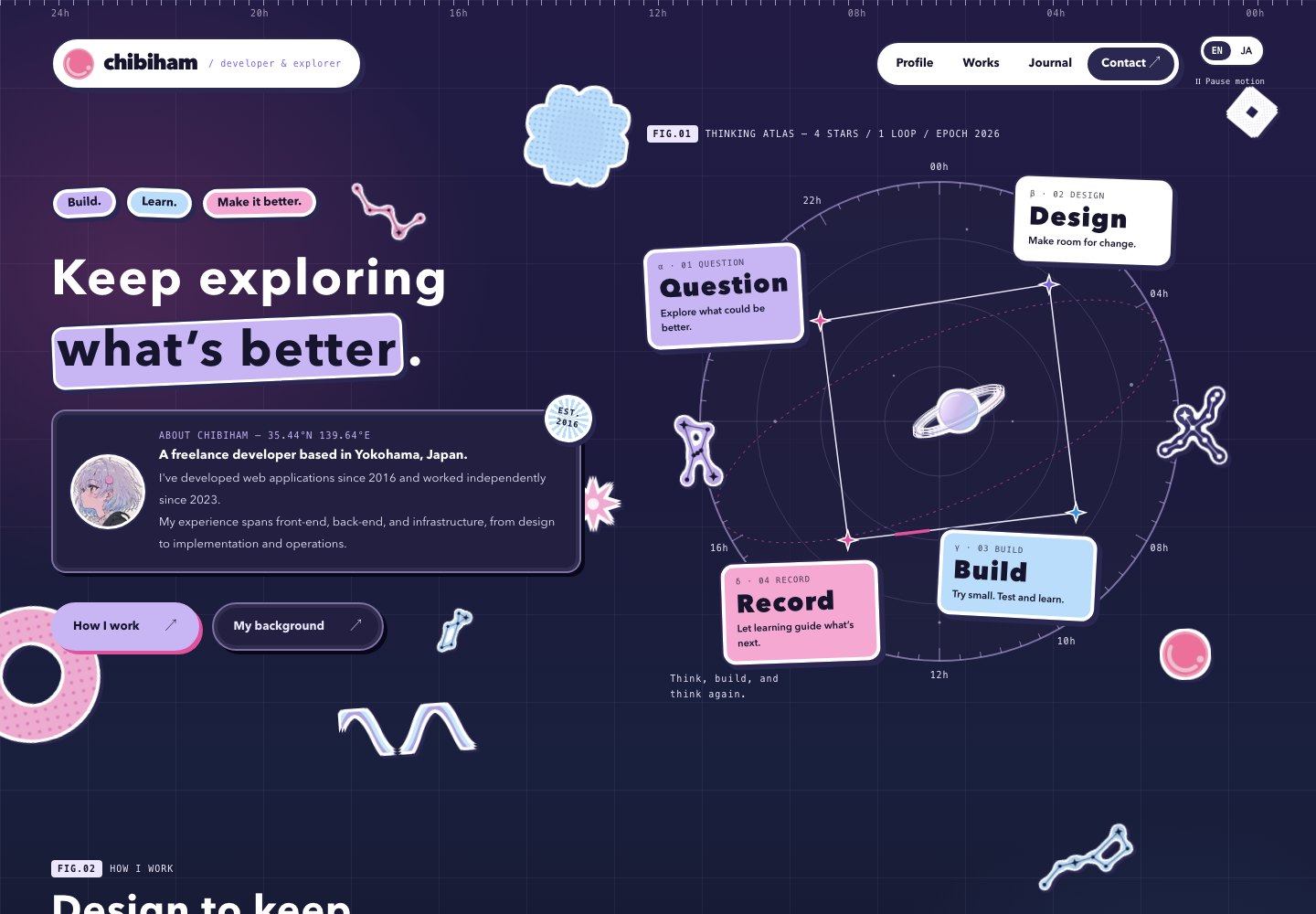
Dark mode swaps the token values. Panels turn navy, while the pastel stickers keep their light-mode look, as if stuck on the night sky.
Features
Responsive Design with CSS Grid
Responsive design implemented using Tailwind CSS Grid.
Dark Mode Support
Colors are defined as tokens (CSS custom properties) in CSS Modules, and their values switch with prefers-color-scheme. Dark mode is applied based on browser settings.
Multilingual Support
Internationalization implemented with i18next and next-i18n-router. See the article for details.
Blog and portfolio article content itself supports multiple languages by preparing separate Markdown files for each locale.
SEO Optimization
Search engine optimization implemented from multiple angles.
- JSON-LD Structured Data: ArticleSchema embedded on each article page for Google Rich Results
- Open Graph / Twitter Cards: Title, description, and cover images dynamically generated per article for optimized SNS sharing
- Dynamic Sitemap: XML sitemap automatically generated in
sitemap.tsincluding all blog and portfolio articles - Canonical URL / hreflang: Canonical URLs and locale-specific alternate URLs set for each page to support multilingual SEO
Contact Form
Form submission implemented using Next.js Server Actions.
- Zod validation with zod-i18n-map for localized error messages displayed in Japanese or English based on browser language settings
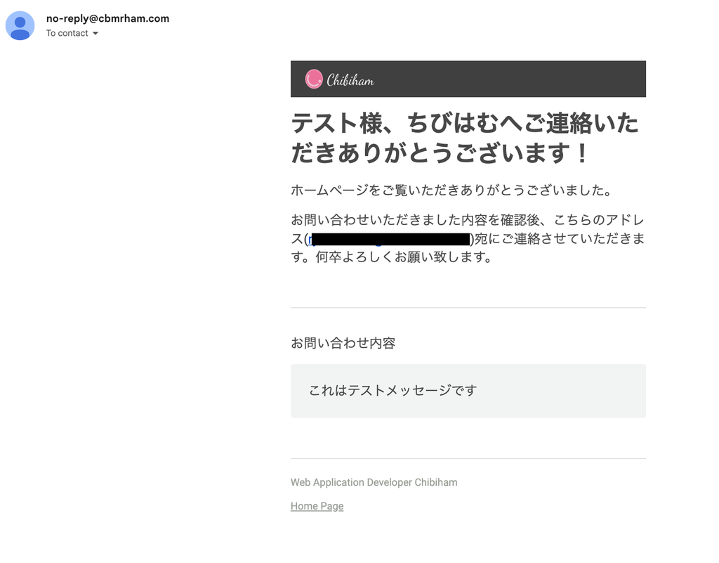
- Rich-text email sending via Resend + react-email. Both the sender and administrator receive emails
- Email templates built with React components, enabling multilingual support with nearly the same implementation as the frontend
Custom MDX Components
Using next-mdx-remote for Markdown rendering with the following custom components:
- CodeBlock: Syntax highlighting with rehype-prism-plus
- MermaidBlock: Client-side rendering of Mermaid diagrams. Automatically re-renders when dark mode is toggled
- Callout: Information and warning callout boxes
- Tables, blockquotes, lists, etc.: Dark mode-compatible styling applied to all Markdown elements
Component Architecture with Atomic Design
Components organized in three layers — Atoms / Molecules / Organisms — ensuring reusability and maintainability.
Content Management: Migration from Notion CMS to Markdown
Initially, Notion was used as a CMS. Components were built one by one to correspond to each Block retrieved via the Notion API. By leveraging Claude 3.7 Sonnet to generate and adjust components matching the API types, nearly all blocks were implemented in about 3 hours.
However, as operations continued, the need to keep using Notion as a CMS diminished, and the system was migrated to simple Markdown file management.
Background for the migration:
- The biggest factor was migrating personal knowledge management from Notion to Obsidian. I wanted to keep article writing and management entirely within the Obsidian vault
- Markdown written in Obsidian can be used directly as homepage content, simplifying the workflow from writing to deployment
- Dependency on Notion API required external communication during builds and cache management
- Maintenance cost for per-block component support
Current setup:
- Markdown files placed at
content/blog/{locale}/{slug}.md - Metadata managed via YAML frontmatter (title, description, cover, date, tags, etc.)
- Frontmatter parsed with gray-matter, MDX rendered with next-mdx-remote
- Supports Mermaid diagrams, KaTeX math formulas, and code block syntax highlighting
- Multilingual content managed via locale subdirectories (
ja/,en/) - Static generation at build time using Next.js
generateStaticParams()